XR Digital
At XR Digital, we blend creativity, technology, and strategy to deliver unparalleled digital solutions. Explore the possibilities with us as we push the boundaries of innovation and transform your vision into reality.

Have you ever noticed how your mind instinctively identifies shapes in the clouds? This innate tendency to recognize patterns extends to our online experiences, where we often assume we know where to click on a website, leading to frustration when expectations aren’t met. The selection of an appropriate user interface design pattern even in Virtual Reality applications becomes pivotal in leveraging this natural inclination for pattern recognition, ensuring a seamless and intuitive user experience.
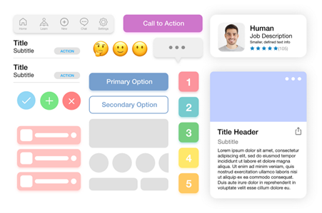
User interface design patterns are reusable solutions to common problems in user interface design. They can help designers create user interfaces that are easy to use, consistent, and efficient. In this article, We will explain what user interface design patterns are, why they are important, and how to use them effectively.
Designers must consider user interfaces very carefully before they set the final design in stone. Failing to do so can lead to user interfaces that are difficult or confusing to navigate, requiring the user to spend an unreasonable amount of time decoding the display—and just a few seconds too many can be “unreasonable”—rather than fulfilling their original aims and objectives.
If you love reading about different technologies, These topics might peek your interest; “What is ARKit” , “Virtual reality in medicine” and “Virtual reality in marketing“.

User interface design patterns are not ready-made templates that can be copied and pasted into any interface. Rather, they are general guidelines that describe how to solve a specific problem in a particular context.
For example, a user interface design pattern for navigation might suggest using a tab bar, a sidebar, or a breadcrumb trail, depending on the type and amount of information that needs to be displayed.
User interface design patterns are often documented in collections or libraries, such as UI Patterns or UI Design Patterns for Successful Software, where designers can browse and search for relevant patterns for their projects.

User interface design patterns are important for several reasons:

User interface design patterns are not rules that must be followed blindly. They are suggestions that must be adapted and customized to fit the specific needs and goals of each project. To use user interface design patterns effectively, designers should consider the following steps:
Before looking for a user interface design pattern, designers should clearly identify the problem they are trying to solve and the context in which it occurs. For example, who are the users, what are their goals and tasks, what are the constraints and requirements, etc.
Once the problem and the context are defined, designers can search for user interface design patterns that match their criteria. They can use online libraries, books, articles, or examples from other interfaces as sources of inspiration. They should also compare and contrast different patterns and evaluate their pros and cons.
After selecting a user interface design pattern, designers should apply it to their interface and customize it according to their specific needs and goals. They should also test and iterate the pattern to ensure that it works well and meets the expectations of the users and the stakeholders.
If you are interested in learning how to create user interfaces using Angular, You can find the relevant information here.

To illustrate how user interface design patterns can be used in practice, here are some examples of common user interface design patterns and how they can be applied and customized for different interfaces:
This user interface design pattern suggests using a prominent and easily distinguishable button that guides users to take the most important action within an interface. For example, in a sign-up form, the primary action button could be labeled as “Create account” or “Sign up” and have a contrasting color or shape from the rest of the elements. The primary action button should be placed in a visible and accessible location, such as the bottom or the right of the form.
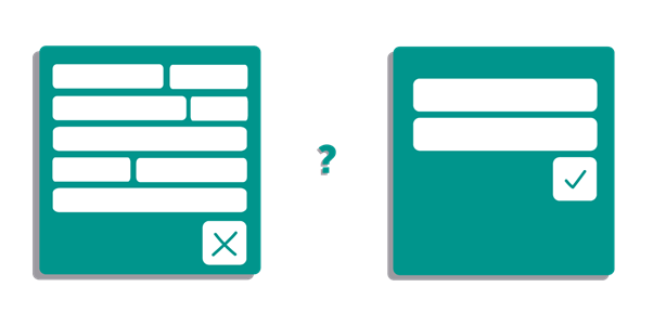
This user interface design pattern allows users to input data in various forms without strict restrictions. For example, in a search box, users could enter keywords, phrases, or questions, and the system would interpret and process them accordingly. The forgiving format pattern can reduce errors and frustration for users and make the interface more flexible and user-friendly.
This user interface design pattern shows users how many steps are left in a multi-step process, such as a checkout or a registration. For example, in a checkout process, users could see a progress bar or a numbered list that indicates the current and the remaining steps, such as “Shipping”, “Payment”, and “Confirmation”. The steps left pattern can help users keep track of their progress and motivate them to complete the process.
This user interface design pattern hides or reveals information or features based on the user’s needs and actions. For example, in a dashboard, users could see a summary or an overview of the most important information or features, and then click on a button or a link to access more details or options. The progressive disclosure pattern can simplify the interface and reduce the cognitive load for users by showing them only what they need at a given moment.
This user interface design pattern uses linked labels to provide secondary navigation that shows the path from the front to the current site page in the hierarchy. For example, in an e-commerce site, users could see a breadcrumb trail that shows the categories and subcategories of the products they are browsing, such as “Home > Electronics > Laptops > Dell”. The breadcrumbs pattern can help users retrace their steps and navigate the site more easily.

Multiple platforms offers the course of “UI design patterns for successful software”, Here are the four most beginner-level to equip you with the knowledge necessary to select the most appropriate display methods and solve common design problems affecting existing user interfaces.
This is a beginner-level course offered by the Interaction Design Foundation, a leading online platform for learning UX design. In this course, you will learn how to use UI design patterns to create user interfaces that are easy to use, consistent, and efficient.
You will also learn how to choose, apply, and customize UI design patterns for different contexts and problems. You can find more details and sign up for this course here: UI Design Certification Course | IxDF.

This is another beginner-level course that covers the same topic as the previous one, but with a different approach and perspective. This course is offered by UX Lift, a curated collection of resources and tools for UX designers.
In this course, you will learn how to use UI design patterns to solve common design problems and improve the usability and user experience of your interfaces.. You can find more details and sign up for this course here: UI design patterns for successful software | UX Lift.
This is a collection of courses offered by the Interaction Design Foundation, covering various aspects of UX design, including UI design patterns. You can choose from different levels of difficulty, topics, and formats, depending on your needs and goals.
You can also access other resources, such as master classes, community, literature, and webinars, to enhance your learning experience. You can find more details and browse the courses here: UX Design Courses | Learn User Experience (UX) Design Online
This is a course offered by Coursera, a leading online learning platform that partners with top universities and organizations. This course is part of a specialization called UI/UX Design.
In this course, you will learn the fundamentals of UX design, such as user research, user testing, prototyping, and UI design. You will also learn how to use UI design patterns to create intuitive and engaging interfaces. You can find more details and sign up for this course here: UX Design Fundamentals | Coursera.

Dark patterns are design patterns that are used in a way that’s meant to mislead, confuse, or otherwise trick a user into performing an unintended action, or to prevent a user from taking an action that they would otherwise have taken.
For example: hiding the “unsubscribe” button in an email, or making it difficult to see, is a dark UI pattern, since it makes it difficult for people to remove themselves from a mailing list.
Some marketers also trick users with colors, layout, and copy choices to create opt-in forms that make it seem like the only positive solution for the user is to add their email to the input field.
Dark UI patterns distort the intended flow of a site or app from the user’s perspective, and chips away at (or betrays) the trust they have in your product.

User interface design patterns are reusable solutions to common problems in user interface design. They can help designers create user interfaces that are easy to use, consistent, and efficient. However, user interface design patterns are not rules that must be followed blindly.
They are suggestions that must be adapted and customized to fit the specific needs and goals of each project. To use user interface design patterns effectively, designers should define the problem and the context, search for relevant patterns, apply and customize the pattern, and test and iterate the pattern. By doing so, designers can create user interfaces that solve problems and delight users.

In the realm of digital innovation, XR Digital developers embrace the principles of optimal user experience, seamlessly aligning with the core philosophy of UI design patterns. As users inherently seek patterns and familiarity in online interfaces, our developers recognize the pivotal role of selecting appropriate user interface design patterns.
User Interface (UI) design patterns are recurring solutions to common design problems that designers face in creating effective and user-friendly interfaces. These patterns serve as guidelines or templates, offering proven solutions to specific issues, such as navigation, interaction, and layout, enhancing consistency and usability in design.
The choice of UI design software depends on various factors, including personal preference, project requirements, and team collaboration. Some widely used UI design tools include Adobe XD, Sketch, Figma, and InVision, each offering a range of features to facilitate the design process.
A successful UI/UX (User Interface/User Experience) design ensures that the user interface is not only visually appealing but also intuitive, efficient, and enjoyable to use. It involves understanding the users’ needs, creating a seamless and accessible design flow, and prioritizing a positive overall experience.
UI design trends evolve, but as of my last knowledge update in January 2022, some prevalent trends included minimalist and clean interfaces, dark mode options, microinteractions, and 3D elements. However, it’s essential to check the latest sources for the most up-to-date information, as design trends can change rapidly.
At XR Digital, we blend creativity, technology, and strategy to deliver unparalleled digital solutions. Explore the possibilities with us as we push the boundaries of innovation and transform your vision into reality.